Choosing the right wood tone for every room
Selecting the right wood tone for your flooring throughout the home is less about chasing a trend colour than creating a visual thread that makes rooms feel related. Boards influence how pale walls, cabinetry and furniture are perceived: light timber can open a compact room, mid-tone grain can ground a space, and deeper brown can give an established home character.
No single shade suits every Australian home. A north-facing room may wash out cool grey boards, while a shaded hallway can make honey timber look flat. The floor must also cope with strong summer sun, humidity, family traffic and different room uses. Choose a palette of undertones, lightness and grain first, then assess full-size samples in the rooms themselves.
Read the light before choosing a colour
Begin with the rooms that receive the most daylight, especially north-facing living areas and east-facing bedrooms. In Brisbane and the Gold Coast, filtered light can still be strong, so a pale sample may appear warmer and brighter than it does in a showroom. In cooler Melbourne or Hobart interiors, golden boards can look softer under evening light.
Look beyond the floor. White walls allow more tonal range, while charcoal cabinetry or deep green walls can balance pale honey timber. Existing skirting, architraves and doors provide another clue: echoing their warmth often looks calmer than fighting every surface. In a classic Queenslander with high ceilings and a broad verandah, light boards can draw daylight inward while retaining the home’s timber character.
Open-plan homes need continuity, but not identical amounts of colour in every zone. Keep the board tone and finish along the main axis, then vary the effect with rugs, lighting and furniture. For a wider refresh, seeing how whole-home design principles connect adjacent spaces is more useful than judging one board in isolation.
Decide between warm and cool undertones
Wood undertones are the colours quietly mixed into the grain: yellow, red, brown or grey. Honey and golden oak tones usually read warm; pale ash and grey-brown boards lean cool; reddish Jarrah and walnut-style finishes fall between them. A product label is only a guide because stain, sheen, lighting and natural figure can change the result.
Australian timber choices make the distinctions practical. Spotted Gum brings honeyed warmth, Blackbutt ranges from creamy blonde to golden brown, and Jarrah has a richer reddish cast. Tasmanian oak offers lively, varied grain for people who like movement across the floor. Availability varies by state and season, so compare a native solid timber with an engineered hardwood in the same tone instead of waiting for one species.
Judge undertones together. A cool floor can make warm timber furniture look richer, while a warm floor beside cool grey upholstery creates useful contrast. Test a metre-sized sample against the actual paint, stone or cabinet fronts, and view it in morning, afternoon and artificial light. It should still belong to the room after the sun moves and the lamps come on.
Balance one floor with different rooms
The living room is usually the best starting point because it sets the visual tone for adjoining halls and dining spaces. Choose a shade that supports the room’s size, ceiling height and furniture. Low, dark tones can feel enveloping in a formal lounge, whereas mid honey timber is forgiving in a family room with sofas, pets and changing décor.
Kitchens require close comparison with cabinetry. White doors can make pale oak disappear unless the boards have enough grain; deep timber doors can merge with a similar floor. Consider the sheen too, because satin boards create more reflected light and a stronger visual line than matte timber.
Bedrooms generally suit softer, lighter or mid-tone woods that create a restful base, while still connecting to the main living areas. Libraries and home offices benefit from calmer floors, so visual interest can come from a rug rather than strongly patterned boards. Narrower planks can also make a compact study feel orderly.
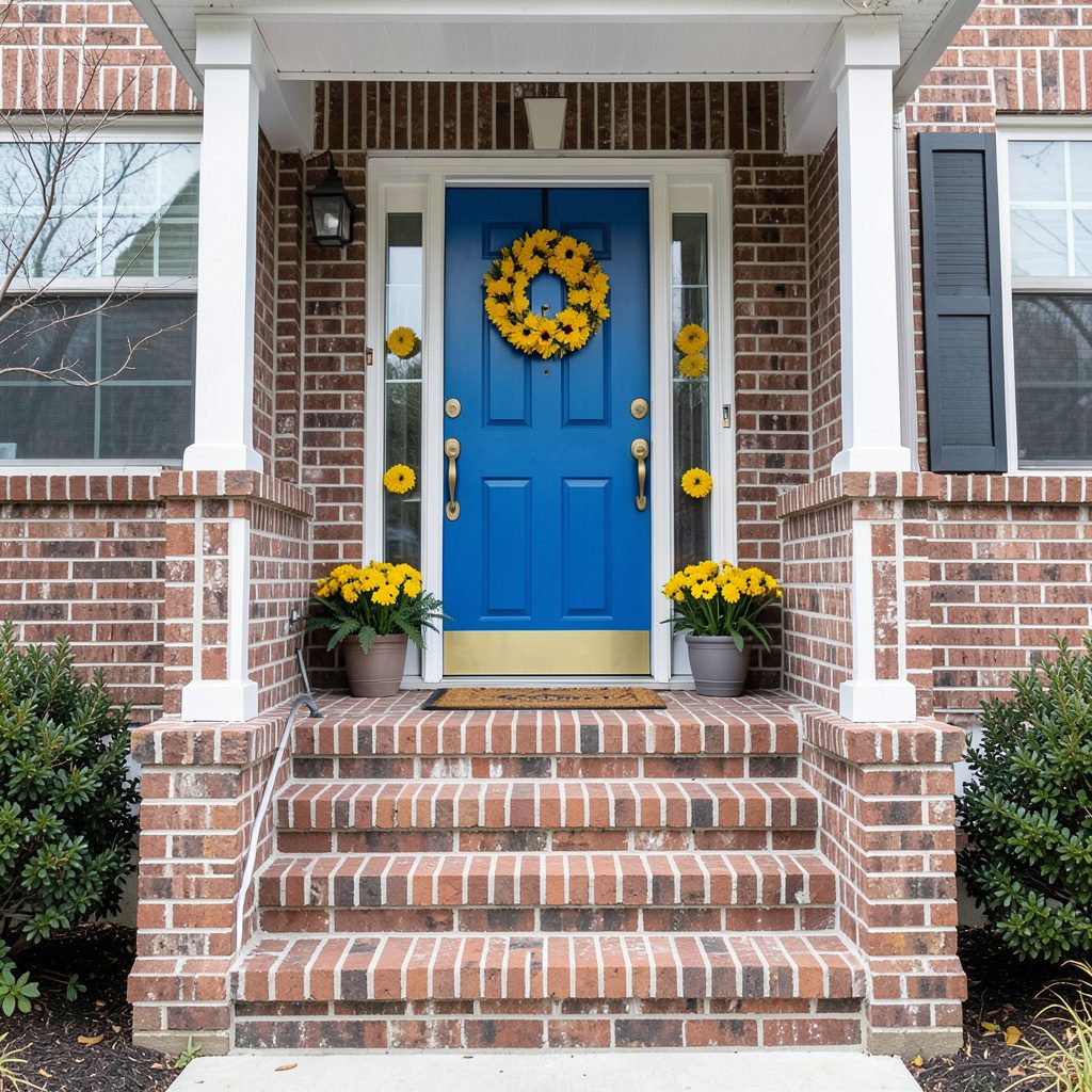
Bathrooms need wet-area suitability, ventilation and cleanability before colour. Real timber should be used only where the product, subfloor and installation method are suitable. Porches face weather, insects and salt-laden air near the coast, so an interior floor can supply the colour reference while the exterior material handles exposure.
Account for Australian conditions and homes
Australian conditions narrow the practical choices. Strong ultraviolet exposure can lighten some finishes, humidity can encourage movement in solid timber, and poorly ventilated subfloors can trap moisture. Coastal homes also deal with damp and salt. Melbourne’s cold, dry winters and Tasmania’s variable conditions call for stable interior conditions, while Queensland homes need close attention to airflow beneath suspended floors. Specify suitable moisture control and expansion allowances rather than relying on generic installation.
The local market offers solid hardwood, engineered timber, bamboo and timber-look products with different wear characteristics and price points. Flooring is commonly sold by the square metre and installed by specialist trades, with underlay, trim and subfloor often quoted separately. Native species can offer locally sourced character, but imported finishes may provide a particular pale tone that is difficult to find. In eastern Australia, termite management also matters around timber subfloors.
Apartments and rental properties add acoustic and compliance questions that a mood board cannot answer. Check the building’s impact-sound and wet-area requirements before selecting a click-system or engineered board. During a larger renovation, NCQRS guidance can be useful alongside instructions from the flooring supplier, installer, designer and local authority. That conversation is cheaper than finding an unsuitable subfloor after removal.
Choose grain, plank and finish details
Two boards with the same colour can look different because of grain and dimensions. Straight-grained oak creates a calm surface, while cathedral or figured grain adds movement and makes a room feel less formal. Wider planks give a strong horizontal rhythm and suit generous rooms; narrower boards suit compact spaces. Random lengths create a relaxed look, while uniform lengths feel crisp and contemporary.
Choose the finish for the household, not merely the photograph. Matte surfaces disguise dust and everyday scuffs; satin and gloss finishes deepen colour and reflect more light. Ask about scratch resistance, recoating, cleaning products and ultraviolet filtering. If boards sit beside sliding doors or receive direct sun, confirm how the finish performs rather than assuming a standard warranty covers fading.
Order from one batch where possible, especially with natural timber, and keep spare boards for future repairs. Before approving the floor, compare loose samples against the installed room and review skirting, transitions and stair nosings. These smaller elements can otherwise make a well-chosen wood tone feel unfinished.
Use a room-by-room wood tone checklist
Start with one baseline for the main floor, then identify which rooms need greater contrast or visual calm. The best whole-home scheme is coordinated, not uniformly beige; small changes in furnishing and light can create variety without introducing a second flooring colour.
Use the checklist below as a decision tool before ordering. Compare samples in occupied conditions, record the selected finish and product code, and allow for natural variation within the board rather than expecting every plank to match.
Whole-home checks
- Light direction and strongest sun exposure
- Existing wall, trim and cabinetry undertones
- Desired level of grain and tonal contrast
- Board dimensions and the visual scale of each room
Room-specific checks
- Living and dining areas versus shaded hallways
- Bedroom warmth against the main flooring palette
- Kitchen cabinetry, splashbacks and benchtop materials
- Bathroom ventilation, porch exposure and wet-area requirements
Bring the whole-home plan together
A final palette should include the floor, walls, fixed furniture and the direction of natural light. Lay the shortlisted boards beside the actual paint and cabinet samples, then check them from the doorway and from seated height. This reveals whether the timber tone supports the room’s proportions or competes with its main feature.
Document the product, batch, finish, plank size and installation details before the floor is ordered. If the home includes a hall junction or multiple living zones, a consistent main-floor tone will usually look more relaxed than several near-matching browns. Keep spare boards and the installation record for future repairs and care.
When the plan is ready, use the project contact page to share floor plans, finish samples and room photos before ordering. Review the palette room by room, confirm one coordinated flooring schedule, and order with confidence.