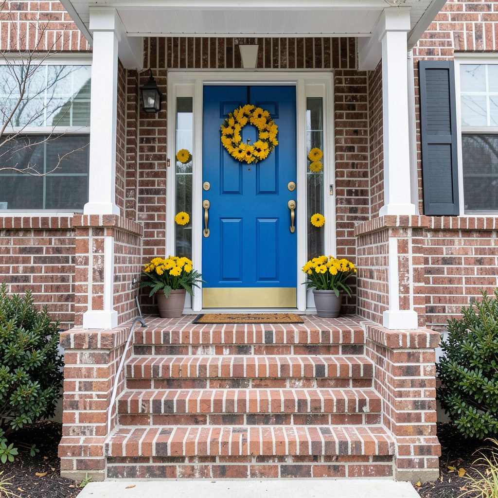
One home, one visual rhythm
Connected rooms often need to feel related without looking like one showroom. A kitchen beside a dining area, a living room opening to a porch, or a bedroom linked to an ensuite can share a colour direction while retaining details suited to their use. The aim is continuity: the eye should move easily between spaces, with no abrupt change in mood or finish.
Creating a cohesive look across connected rooms with a unified palette starts with relationships between colours, not with choosing a shade for every wall. A dominant tone can settle the largest surfaces, supporting colours carry the scheme into furniture and accessories, and a restrained accent gives each space a focal point. Repetition should be recognisable but not rigid, allowing a rattan chair, ceramic vessel or artwork to provide variety.
The strongest scheme also accounts for how each room is used. Australian households regularly move between cooking, working, relaxing and entertaining, so finishes must withstand daily activity as well as good daylight. Pale colours can carry limited light through a Sydney or Melbourne apartment, deeper greens and blues can moderate bright spaces in Brisbane, and earthy shades can soften the strong sunlight found in many Adelaide and Perth interiors.
Start with the finishes you cannot move
Begin with the elements that are expensive or disruptive to change: flooring, cabinetry, benchtops, wall tiles and window frames. Note whether the timber is golden, brown or grey, whether the stone veining is warm or cool, and whether the existing white is genuinely neutral or carries a trace of pink, green or yellow. Those undertones determine which neighbouring colours will appear deliberate rather than accidental.
| Direction | Dominant base | Supporting colours | Accent | Best suited to |
|---|---|---|---|---|
| Soft mineral | Chalky off-white | Putty, mushroom, pale timber | Muted olive or rust | Brick, stone and warm timber |
| Coastal neutral | Cool white | Soft grey, sand, eucalyptus | Teal or deep blue | Abundant daylight, glass and metal |
| Grounded contrast | Warm white | Charcoal, walnut, mushroom | Ochre or brass | Dark joinery and heritage details |
| Botanical balance | Ivory | Sage, stone, charcoal | Terracotta or plum | Plants, natural textures and patterned textiles |
View complete sample boards rather than small paint chips whenever possible. Check them in morning, midday and evening light, then compare them with the existing flooring and cabinetry. Matte walls absorb light differently from satin or gloss joinery, so the same colour can feel softer, sharper or warmer depending on the finish.
Carry colour through visible sightlines
Treat connected rooms as a sequence of related views. Repeat the dominant colour on major architectural surfaces, then place the supporting tones where furniture and textiles naturally draw attention. This creates rhythm without making every object match. In an open-plan kitchen and living area, for instance, the cabinetry might establish the base colour while cushions, curtains and artwork carry it around the room.
Architectural details can also bridge separate spaces. Skirting boards, architraves, picture rails and internal window trims create horizontal and vertical lines that visually link rooms; this guide to mouldings and trim demonstrates how decorative finishes can give plain rooms character. Repeating one trim finish throughout connected zones is a subtle way to strengthen continuity without another layer of colour.
Repetition does not require identical rooms. A calm bedroom might share the living room’s neutral wall colour but use deeper textiles for warmth, while a bathroom could echo the kitchen’s stone through a different scale of tile. Keep one or two colours visible from more than one viewpoint, then allow each space to develop its own texture and function.
Turn the palette into repeatable choices
Once the overall direction is clear, translate it into practical decisions that can be applied consistently across the home.
- Set a clear hierarchy by using the dominant tone on the largest visible surfaces, supporting colours on secondary areas and the accent colour only in smaller, purposeful doses.
- Match the undertone by repeating the warmth or coolness found in the flooring, cabinetry or stone across neighbouring walls, textiles and decorative objects.
- Coordinate fixed finishes by checking doors, tiles, timber samples and metal hardware together before ordering, since small differences can make a coordinated scheme look disjointed.
- Repeat colour at different scales through walls, larger furniture and accessories, allowing one hue to travel through the room without dominating every surface.
- Use texture to bridge tones, combining matte plaster, woven fibres, timber grain, smooth stone and metal to add depth when the colours themselves are restrained.
- Test materials in place by viewing sample doors, fabric squares and boards under both daylight and artificial lighting at the time the room is normally used.
Apply these decisions room by room, but preserve the same hierarchy. Paint colours may shift between a kitchen, bedroom and bathroom because of light and function; the repeated undertone and accent should still make the spaces feel related. Save the largest colour changes for areas that are visually separate or have a strong practical reason for differing.
Fit the scheme to Australian conditions
Australian daylight can be intense, particularly through north-facing glazing in southern cities and east-facing windows that receive sharp morning sun. UV exposure can fade fabrics, timber finishes and painted surfaces over time. Specify UV-resistant upholstery, consider low-emissivity glazing when windows are being replaced, and position pale textiles away from prolonged direct exposure. Testing samples on each side of the house can prevent a favourite colour from looking harsh in only one room.
Climate and the local renovation market also affect practical choices. Humidity in Brisbane and northern areas can encourage the use of stable timber, porcelain tile and moisture-resistant cabinetry, while Melbourne’s variable temperatures call for layered furnishings and finishes that tolerate expansion and contraction. Check stock levels and lead times for modular kitchens, engineered stone and locally manufactured timber pieces, as short-order options and custom joinery can differ considerably in price and availability.
Storage is part of the visual composition as well as a functional necessity. The practical organisational ideas on Easy Organized Home can help keep worktops, shelving and display areas calm enough for the chosen colours to register. Concealing visual clutter allows repeated accessories to act as deliberate links between rooms instead of competing with the underlying scheme.
Renovation choices must also fit local building requirements. The National Construction Code and state or territory variations can affect glazing, energy efficiency, wet-area waterproofing and external alterations. In declared bushfire-prone areas, Bushfire Attack Level requirements may influence the specification of windows, screens and doors. Confirm any structural or external changes with the relevant council and a registered building practitioner before ordering materials.
Build the scheme room by room
Start in the room with the greatest concentration of fixed finishes, usually the kitchen, and assemble the palette around its cabinetry, flooring and bench surface. Extend the dominant tone into the adjoining living area, then pick up the accent in a rug, artwork or chair. A bedroom can use the same supporting colours in bedding and curtains, while a home office benefits from the base colour on walls and the accent in a smaller, focused area.
Work from permanent elements towards removable pieces. Confirm the fixed palette, settle paint and cabinetry, then select furniture before buying smaller accessories. This sequence reduces expensive mismatches and makes it easier to judge the room as a whole. A simple sample board photographed in daylight can also become a practical reference for every later purchase.
Choose your dominant tone today, gather the fixed-finish samples that sit comfortably beside it and record the colours you want repeated in each adjoining room. A considered palette will make connected spaces feel unified while allowing every area to retain its own purpose and personality.